Branding & Identity | Exhibition
This is eye-conic
What's expected?
What we've done
Naming
Visual identity
Verbal identity
Brand world
Motion graphics
Create the identity for a first-of-its-kind graphic design exhibition in the university that showcases student work with originality—setting the tone for future events.
What resonates?
We’re here to create a bold, vibrant identity for a graphic design exhibition that’s all about celebrating student creativity. Think fresh ideas, diverse styles, and eye-catching visuals, all wrapped up in a design language that speaks to a college crowd. The goal? To craft an identity as dynamic and exciting as the work on display—something that grabs attention and leaves a lasting impression.
What clicked?
Design that demands attention. Because it’s bold, unexpected, and impossible to ignore.

See it in motion
So, why Kaleido?
The name 'Kaleido' meaning 'beautiful forms' is inspired by the kaleidoscope—a tool that turns simple fragments into mesmerizing patterns with just a twist. Like its namesake, Kaleido celebrates the transformative quality of design: taking diverse ideas and perspectives and molding them into a cohesive experience.

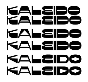
An interplay of the vibrant shapes and the sharp precision of a kaleidoscope with the funky reverse stress font is what forms the wordmark for Kaleido. A visual identity that captures the playful energy and creative flair of the exhibition.


Caught your eye?
Coincidentally, we found our theme staring at us right in our wordmark. The eye-like shape in the ‘A’ inspired our tone of voice, packed with eye-related words and puns. It’s a nod to vision and perspective, perfectly aligning with the exhibition’s focus on fresh, imaginative work. Eye bet you’ll love it!

Along with the theme we also decided to extend our eye communication to wayfinding. We call them pathfinder pupils and wherever they are looking is the direction you’re supposed to be going in. You just have to use your eyes ;)


The mockups and product photography? They’re not just placeholders—they’re a vibe. Just like the forthright attitude of the youth, our shapes unapologetically frame the work, making every subject pop like it’s ready for the spotlight.


We designed placards to ensure every project could speak for itself, even in the absence of its creators. Laser-cut from 5mm MDF and spray-painted by hand, these placards added a personal, handcrafted touch while effectively showcasing group details and project insights.


Some behind the scenes struggle for you to enjoy.


